Monday, 5 November 2012
Tuesday, 9 October 2012
Typographic statement illustrations
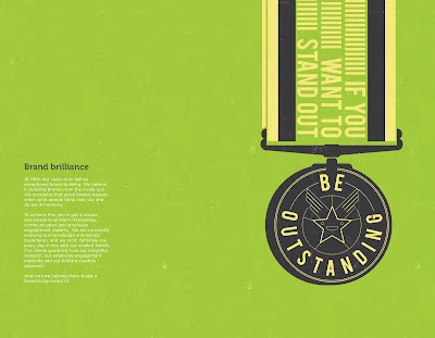
h&h - a communications & branding company, commissioned me to create a series of typographic illustrations for their brand book.
The brief was to represent each statement with a unique illustration for each spread, the only limitation were the companies brand colours.
The brief was to represent each statement with a unique illustration for each spread, the only limitation were the companies brand colours.
Labels:
Branding,
Design,
drawing,
graphic design,
Illustration,
Typography
Tuesday, 2 October 2012
Reloaded Vodka Packaging design
Here is a visual of some packaging design I did recently for a large drinks manufacturer.
The brief was to create a design with an element of American Graffiti style Calligraphy. The product title type was created from scratch, and I then added spikes of energy to reflect the caffeine ‘kick’ the drink contains.
I thought the bullet shape would hold the supporting label info together well and also tie in with the name.
Labels:
graphic design,
Packaging Design,
Red Square,
Typography,
Vodka
Friday, 28 September 2012
Leeds Inspired poster design commission
I was asked to design/illustrate a poster to promote the Leeds Inspired website, a site that tells people about all the cultural events going on in the area.
The brief was to communicate the strapline ‘See what's out there'. I decided to create a kind of visual puzzle that contained this line. Each panel also shows ‘things’ going out or looking out; so it works on 2 levels.
The brief was to communicate the strapline ‘See what's out there'. I decided to create a kind of visual puzzle that contained this line. Each panel also shows ‘things’ going out or looking out; so it works on 2 levels.
Tuesday, 25 September 2012
Breaking Bad inspired illustration
I enjoy watching the TV series ‘Breaking Bad’ so much it inspired me to have a crack (excuse pun) at creating a simplified illustration.
The blue is a reference to the colour of the meth drug featured in the show. I wanted the craggy lines on the face to tie in with the chemistry flask markings.
The blue is a reference to the colour of the meth drug featured in the show. I wanted the craggy lines on the face to tie in with the chemistry flask markings.
Labels:
Breaking bad,
digital media,
Illustration,
minimalist
Wednesday, 20 June 2012
Monday, 18 June 2012
Illustrated Wardrobe
This will be shown as part of a group of work supporting Jamie Reid's Ragged Kingdom Exhibition, at Temple works Leeds.
Labels:
Abstact,
Acrylic,
Illustration,
Ink,
Minimal graphic illustration
Tuesday, 20 March 2012
Monday, 19 March 2012
Thursday, 1 March 2012
Tuesday, 17 January 2012
Subscribe to:
Comments (Atom)


